Sunday, 18 December 2011

Font for magazine cover


These are some of the possible fonts for my magazine cover, I was at first attracted to the wonderfully outdated Mistral font that everyone so hates, this is because of the new status attached to it after the advertising of the 2010 film Drive (empires best film of the year). The film gives the font a new stylish appeal. After some consideration I have come to the conclusion that a more basic font would be suitable, something slightly less controversial. I want to go with something bold and clear, to grab the reader or passer by. The font I have chosen conforms to these conventions and has a bold/iconic appeal. Simple is the way to go.

The final font.

I want the font for my poster to be quite elegant and sleek so it will most probably stay in the black font, this will stand out amongst the light blue surroundings of the image on the cover. The smaller text featured will be a mix of black and white as these both compliment the colours used on the image. 

Poster Layout


This will be the basic layout for my film poster. I have decided to include the two main elements in the film itself, my main character (which the story is framed around) and the mystery of her family (top image). The poster will be split into two halves representing the psychological split in the character. I want to have a close up image of the main characters face to convey her distress and emotion, which will show the audience they are not in for a comedic film. The top image will be slightly out of focus to create mystery around the characters and to show that they are perhaps not real or are paranormal beings. I have already chosen the font for my title as shown in the below post, this will fit in well as it is a 'horror' type text which will blend in with the surroundings of the poster.

(Apologies for the awful drawings.)

Possible magazine layouts

These are some possible magazine layouts I have created, through looking at the elements included in popular film magazines such as Empire or Total Film I have tried to deduce what makes the covers both aesthetically pleasing and what draws the reader in. I have chosen this imagery for my magazine at it is quite ambiguous and photographically pleasing, the film featured doesn't look like an upfront horror which opens up it's audience. I have decided to go with the right hand image layout, or something similar to this, the final design will be drawn out soon. I think it would be better to include the shot which is farther away as it opens up space for text on the magazine cover, as it is an Arthouse feature there will need to be bigger films shown around the image to entice a large audience rather than the niche genre which the film includes. 

Thursday, 15 December 2011

Font for poster

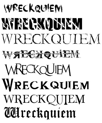
These are some fonts that I thought might be suitable for my film poster. As my character's mindset is damaged or splitting then a title with cracks in might be suitable, although perhaps slightly predictable. I really like the 5th title, it is recognisable as a horror type font and appears slightly dismantled or fragmented, fitting in with the theme.
I asked my focus group what they thought of this font and they agree'd that it fit well in with the story and style, it was between that and the second font.
For my magazine I will go with a softer font to show that all types of films will be featured, not just the horror genre, it will be more universally acceptable.

The final font.

As my poster will feature very dark colours I want the title to stand out, I think I will make it red to contrast with the neutral and dark colours of the imagery surrounding the text. It also suggests a horror theme. The names of actors and film festivals will most probably also be in red, when putting this together I can experiment further with colour. 

Magazine Titles

Play on words? Something to do with the film industry... IDEAS

The Reel World
Reelity
Screen Scream
Drive In (like the movies..)

I have chosen the title 'Drive In' for my magazine, the phrase is associated with the movies making it clear what my magazine will feature. I will need to experiment with fonts and layout for this.

Film Titles

IDEAS

Words associated with theme/story of film : Nature, earth, hell, shadow, shatter, obscure, eclipse, satan, ruin, paranoia..

Nature's Shadows
Satan's Church
Shadow Games
Nature's rejects
Requiem (already a film name, edit slightly?


WRECKQUIEM - Requiem (the Mass celebrated for the repose of the souls of the dead) + Wreck (the ruin or destruction of anything: the wreck of one's hopes) 


I have chosen the title Wreckquiem for my film, this will feature at the end of my teaser trailer. I thought this title would be suitable as it includes themes from the film such as the paranormal associations with requiem (the dead) and the destruction of my characters mind/life.

A picture storyboard


These are the pictures from the scenes I have filmed so far, a few more in the beginning and end need to be added. I will begin editing these as soon as they have been uploaded to the correct software.

Tuesday, 13 December 2011

Things to blog:

  • Concept board
  • Animatic
  • Audio recording

Practical things to do:

Teaser Trailer
  • Finish filming (music box, first scene, window/lamp post)
  • Put song on memory stick
  • Edit + complete
Magazine Cover
  • Finalise layout (draw + attempt to create on computer)
  • Choose/take background image
  • Decide on text to go on the cover
  • Experiment with fonts and colour
  • Experiment on pc with different layouts
  • Put final piece together
Poster
  • Take the image for the poster
  • Experiment with fonts and colour
  • Decide on what text to feature on poster
  • Practise on photoshop putting the two together
  • Complete final piece

Thursday, 8 December 2011

Catton park - location

These are the location shots that will feature in my Teaser Trailer, I will also be filming briefly in a graveyard, which I will upload in due course.


Monday, 5 December 2011

Camera Techniques


These are some images that I have found which reflect the type of camera angles/mis-en-scene I will be using in my trailer. When filming I will also take pictures of the scenes to compare with what look I was trying to achieve. I really like the camera technique used in the image from 'Antichrist' (left+up), I might try to mimic the positioning of the camera. The way the camera is positioned allows the audience to look in on the scene from a hidden place, it gives the feeling that someone is watching or preying on the woman. This will be good to create a sense of paranoia with my character.

Exhibition Methods

There are many ways of exhibiting different kinds of trailers, these are often shown on places such as...
Feature film websites
Youtube
Social networking
Teaser websites
Teasers before films at the cinema

Here is a link to the psychological horror The Blair Witch Project's website, here some scenes from the film are shown aswell as information about the film itself. When entering the website you are shown a video straight away, this takes away the user control and creates intrigue about the move. http://www.blairwitch.com/


Usually the the more popular social networking websites feature blockbuster type films, this is shown here on http://www.myspace.com/, it displays ads for music and film (Sherlock Holmes 2). It would be more expensive to advertise on popular sights, this is similar to how high budget films try to get themselves spots between shows on Tv such as the Superbowl.

Youtube actually has it's own movie channel, this is where you can find information about films and watch trailers. It is also possible to rent films here, making youtube the ultimate video sharing site. There is quite a mix of films featured here, although on the main page it is often blockbuster films shown.


IMDB has more of a selection of films/trailers that are exhibited, this may be because the site itself is mostly popular with regular cinema-goers or film watchers, rather than the casual consumer. It is quite an interactive site where users are encourages to ask questions and comment, therefore it may have more a niche user market. This would be a place for me to consider exhibiting my trailer, as it would more more readily accepted here rather than on the more mainstream video sharing websites.


Rotten Tomatoes features a wide range of films in its database yet on the homescreen mainly shows blockbusters, conforming to more popular film audiences.


I have found it quite difficult to find a well known website that primarily feature low budget or arthouse films, unless it is the actual film website or a cinema page. The only place that I have managed to find out about new arthouse films is in actual arthouse cinema's and sometimes in larger cinemas before a low budget or arty film is shown. This is more rare as arthouse films have irregular times in large cinema's such as Odeon or Vue, and are often only shown for a week or two at a time. Arthouse cinema's such as Cinema City provide their own small magazines which give information about upcoming films and features being shown, this is useful for the arthouse audience as it gives them information that is often difficult to find.

Props

The Dress - The dress my main character will be wearing in the second scene is significant to her mindset at that point in the 'film', it will be a white strappy dress. I wanted my character to wear something that bares a lot of skin without being indecent, this is to show her vulnerability in that stage of her story. The white colour represents her innocence and purity before her mind is tainted.


Tape Recorder (if i can find one) - This will be used in the first scene to show that my character is being held in some kind of institution, it normally signifies that the subject is being watched and listened to, analysed perhaps. The type of institution is left for the audience to decide.

Red Balloon - This will be released by my main character in the field we are filming in, I wanted to use a red balloon in particular as it is often a sign of danger. She will be letting the balloon go to show that she is loosing grip of herself and reality, making the warning sign of red significant.


Red Clothing - Red clothing will be worn by the child figure in my piece, she acts as a guide for my main character, yet the audience does not know whether this is for good or bad. I wanted her to stand out amoungst the dark and natural surroundings, red will feature throughout the piece.


Broken Mirror - I will be scattering pieces of broken mirror on the floor of the forest we are filming in, showing the cracks in my characters personality and reality. She does not recognise her own reflection, and I want her to see the child reflected in one of the pieces. This is used similarly in the film Black Swan as Nina unknowingly stabs herself with a shard of mirror as she fights with her own personality.


Music Box - I want to have a shot of a music box inbetween some of the flashing scenes towards the end of my trailer, the serenity of this will contrast to the scream that will feature in the background. The music box is significant as it is something usually related to childhood, refering to the child guiding the main character and her move away from innocence. I want to stop the classical music here and have the sound of the box playing, the eery music leading the audience to the end screen of the trailer.

Locations

I have been studying locations in different psychological horrors to see if my area ideas for filming will be suitable, I have found that both my ideas and the pictures I have found mix quite well. Many locations in this genre will feature run down buildings, dark forests and generally dismal or negative areas. This is shown in the following...


Here we find a closed range of locations, desolate houses, misty woods, run down buildings and a churchyard. These are all common settings for this genre, places that leave the audience feeling uneasy or create a sense of mystery and isolation.
My own locations will focus mainly on forest areas, this is the focus for the psychological mindset of the main character. I will be filming in a graveyard and field also, places which show the different stages of my characters journey.
I will be uploading pictures of my filming locations shortly.

Monday, 28 November 2011

Costume

This is an interesting article that I found when researching effective costume design in film, it discusses the meaning and messages behind certain articles of clothing and their relation to the character wearing them. This will be useful when it comes to dressing my own characters.

When thinking about how I would dress my characters in the teaser trailer I looked at films which have characters similiar to my own main character, as well as films with the same psychological theme.
I have looked at the attire of both male and female characters that are portrayed in film with a psychological disorder, the images I have found all have a similiar theme in clothing, which helps me greatly with how to dress my character.
The character of Nina in Black Swan is clearly portrayed as having a mental disorder, which has been viewed as a Dissociative disorder. This involves disruptions or breakdowns of memory, awareness, identity and/or perception. This will be similiar to my own main character in the teaser trailer, as she is going through circumstances which portray the disorder. In the film Nina's main colour themes are pink and grey, she often wheres clothes which cover all of her skin and cosume her, this could act as a protection against the world she does not know outside of ballet. The layers of clothes she wears could portray the layers of her personality, she becomes lost in herself and does recognise reality.

 
The character of Susanna in Girl, Interrupted suffers from a borderline personality disorder. She often defeminises herself through wearing quite masculine attire, involving jumpers and jeans. I have found that in quite a lot of the characters studied, dark clothes, mostly layered shirts and jumpers are worn. This may reflect their dark personality, wanting not to be noticed, or as a protection.


This wintery/layered attire is again shown in these two mentally unstable characters, I have found that the more sinister mentally ill characters such as Jack Torrence in The Shining wear colours such as red as a sign of danger or evil. As my character intends no harm on others I will dress her in these dark layered clothes, although the child that features in my piece will be dressed in red, to portray her as a warning or sinister character. In the beginning of the piece I want my character to be dressed almost entirely in white, to portray that she is being held in some kind of institution, this will change to a summery dress in the second scene. That scene will show the moments when the character leaves their previous sane self behind and takes her journey into darkness. I have chosen for her to wear a dress as she will have a lot of skin on show, showing her vulnerability and weakness. As the scenes progress the attire will become dark and layered, showing the character going into herself and letting go of reality.