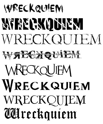
These are some fonts that I thought might be suitable for my film poster. As my character's mindset is damaged or splitting then a title with cracks in might be suitable, although perhaps slightly predictable. I really like the 5th title, it is recognisable as a horror type font and appears slightly dismantled or fragmented, fitting in with the theme.
I asked my focus group what they thought of this font and they agree'd that it fit well in with the story and style, it was between that and the second font.
For my magazine I will go with a softer font to show that all types of films will be featured, not just the horror genre, it will be more universally acceptable.
As my poster will feature very dark colours I want the title to stand out, I think I will make it red to contrast with the neutral and dark colours of the imagery surrounding the text. It also suggests a horror theme. The names of actors and film festivals will most probably also be in red, when putting this together I can experiment further with colour.


No comments:
Post a Comment